
Toronto Environmental Alliance Project Background
Project Details
Redesigned the Toronto Environmental Alliance website to boost engagement, streamline navigation, and reflect TEA’s mission—driving more volunteer sign-ups and donations from both new and returning supporters.
I conducted Surveys, Competitor Analysis, Information Architecture Audit, Wireframing & Prototyping, Visual Design and Usability Testing.
My Role: UX/UI and Visual Designer
Results
Clearer layout and streamlined messaging to improve engagement
Simplified navigation flow
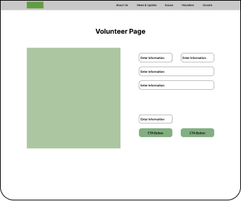
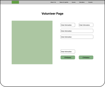
Enhanced Volunteer Page Experience
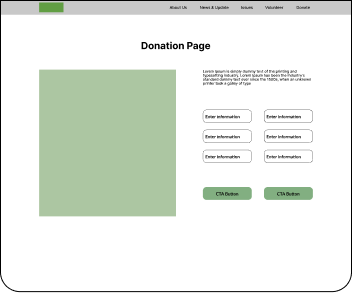
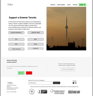
More Accessible Donation Page
Improved mobile responsiveness
Stronger Emotional Connection
Clearer visual hierarchy
Project Duration
Project Duration
4 Weeks
Group project
Rebranding
The Toronto Environmental Alliance website was outdated, difficult to navigate, and visually inconsistent, making it hard for users to find key information, sign up to volunteer, or donate. The original web design failed to reflect TEA’s progressive mission, limiting engagement from both new and existing supporters.
Design Problem
Design Problem


Empathize
Define
Test
Prototype
Ideate
We conducted community surveys and a competitor analysis to gain insights into user needs and expectations, identifying gaps in TEA’s original website experience.
Usability testing with two participants provided critical feedback. Iterative refinements were made to ensure the final design was intuitive, inclusive, and impactful.
User data was synthesized into personas and key pain points, helping frame the core usability challenges to be addressed in the redesign.
We brainstormed and used card sorting exercises to generate and prioritize ideas that improved navigation, user engagement, and overall site functionality.
Wireframes and high-fidelity prototypes were created in Figma, showcasing revamped navigation, modern layouts, and an engaging user experience aligned with TEA’s mission.
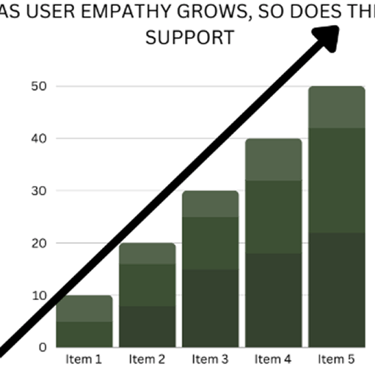
Supporters want more than a transactional experience—they seek meaningful involvement and a sense of impact. Rebuilding trust and offering flexible ways to engage can transform passive donors into passionate advocates.
Key Take Away
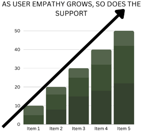
Graph 2: Support is driven by belief in the cause and trust in the organization, pointing to the importance of transparent, emotional messaging.
Graph 1: 90% of participants were unaware of TEA or its mission, highlighting a need for better visibility and storytelling.
Graph 3: Most users are motivated by local impact, suggesting TEA should frame initiatives around neighborhood-level environmental issues to increase engagement.
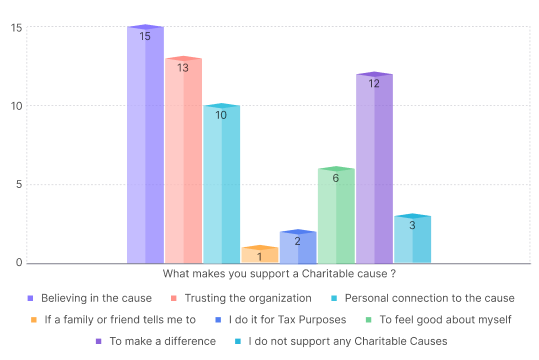
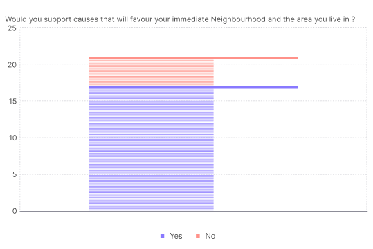
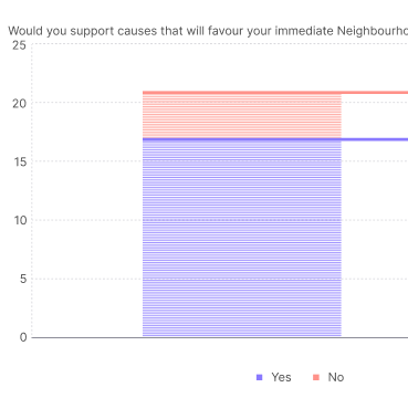
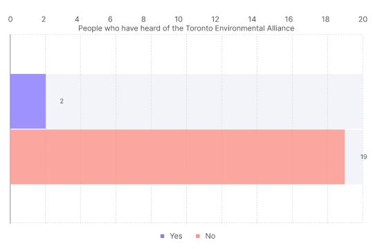
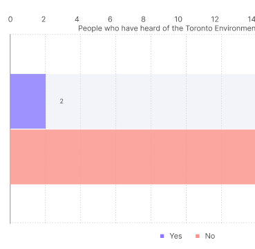
A survey of 21 users revealed key issues: low awareness of TEA, confusion due to outdated design, and unclear messaging around its mission. Users were more likely to engage with organizations that are transparent, have a clear purpose, and show local community impact. These findings shaped our focus on creating a cleaner, more intuitive, and mission-driven site.
Data Insights
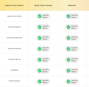
Competitor Analysis
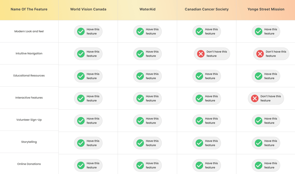
We analyzed similar environmental and nonprofit websites, observing that many leveraged a modern visual design, strong storytelling, and clear educational resources to inspire trust and action. These sites emphasized community impact, used consistent branding, and simplified volunteer and donation pathways—features TEA’s site was lacking. These insights shaped our strategy for creating a more engaging and intuitive experience.
Site Audit
Principle
Issues
Hierarchy
Balance
Contrast
Repetition
White Space
Accessibility
Imagery Use
Uneven distribution of visual weight.
Multiple elements compete for attention.
Low text contrast; weak visual distinction.
Inconsistent styling across cards.
Insufficient padding between sections.
Low contrast between green text and white background.
Some pictures used are generic or repetitive.
We conducted a thorough audit of the existing TEA website to identifying issues. As a group, we collaborated to categorize usability issues and prioritize them based on user impact.
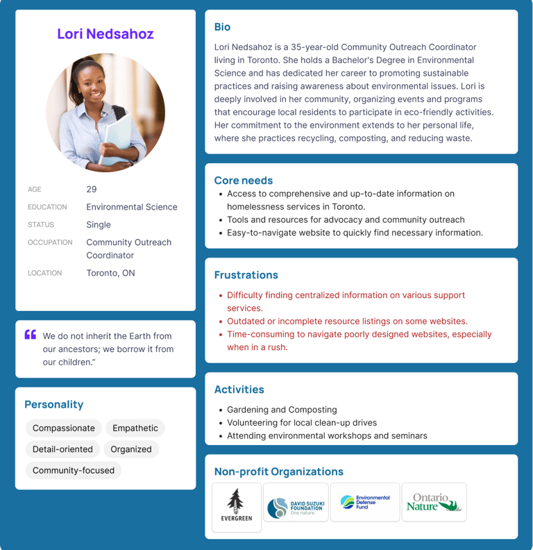
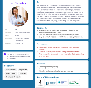
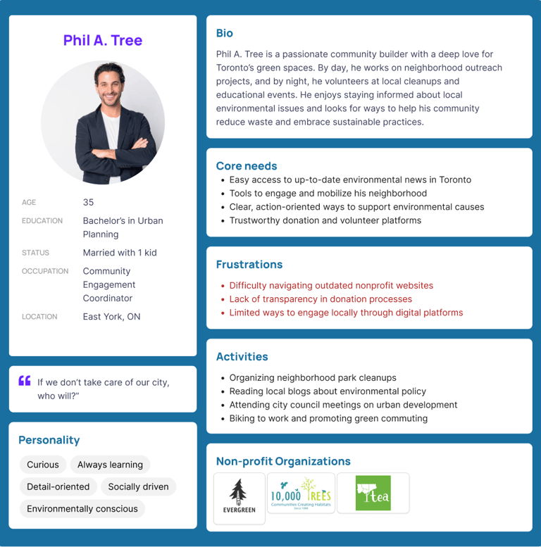
User Persona
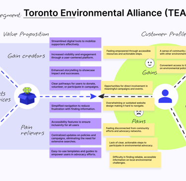
We designed for environmentally conscious Toronto residents aged 25–45 who want to support sustainability causes but often feel disconnected due to unclear messaging and outdated nonprofit websites. Creating user personas helped us understand their needs, ensuring the redesign aligned both with user expectations and TEA’s mission of fostering community-driven environmental change.
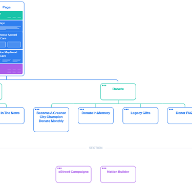
Using open and closed card sorting with classmates, we uncovered how users naturally group content. This informed a clearer, flatter navigation system, prioritizing key actions like volunteering, donating, and learning about issues. The site structure now supports faster decision-making and better content discoverability.
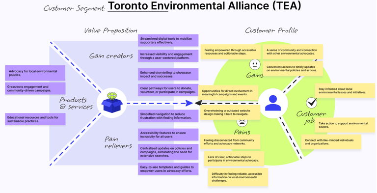
Value Proposition
Information Architecture
Using open and closed card sorting with course mates, we uncovered how users group content. This informed a clearer, flatter navigation system, prioritizing key actions like volunteering, donating, and learning about issues. The site structure now supports faster decision-making and better content discoverability.
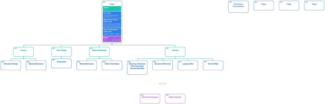
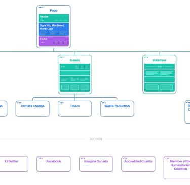
Key Outcomes of Card Sorting
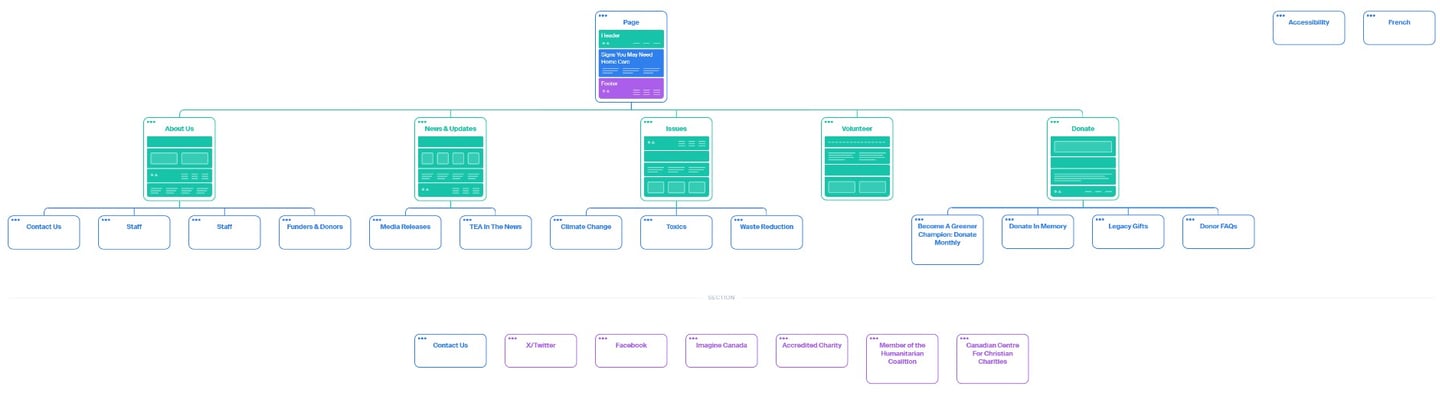
Simplified Navigation Structure: The primary navigation was restructured to prioritize the most sought-after information and actions. while the footer had access to organizational sponsors and additional resources, which shaped the inclusion of new footer links.
Prioritization of Engagement Tools: Volunteer and donation pages are more prominent, fostering greater participation.
Stronger Community Focus: News, updates, and issue pages provide comprehensive resources to educate and connect users.
Enhanced User Experience: Both the header and footer were elevated visually and functionally, ensuring clear pathways for users to engage with TEA’s content.
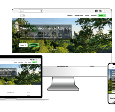
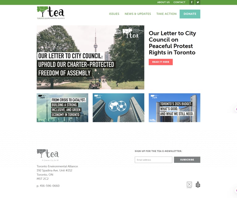
Previous State
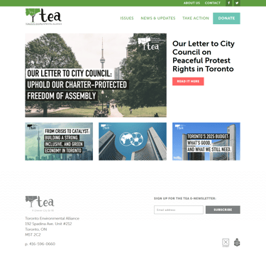
New State
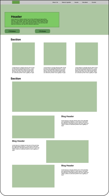
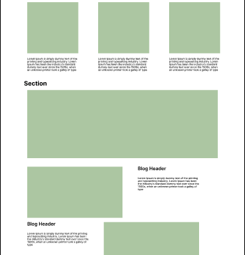
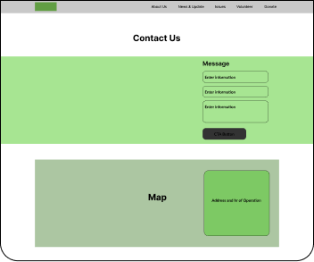
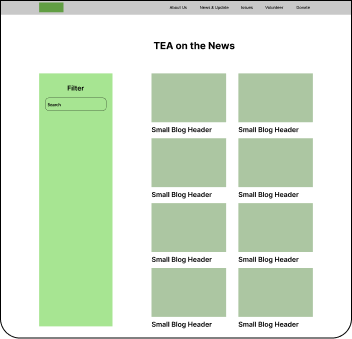
We explored layout ideas inspired by non-profits and aligned them with TEA’s goals using grayscale wireframes. These low-fidelity designs focused on clear hierarchy, intuitive navigation, and easy access to key actions like volunteering, donating, and learning. This phase ensured the structure met user needs and validated the information architecture before moving to high-fidelity design.
Low-Fidelity Design


High-Fidelity Design
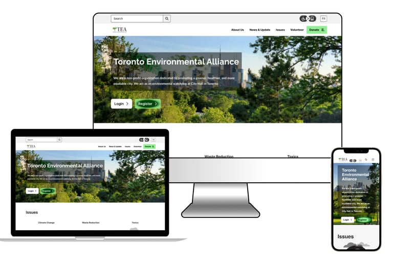
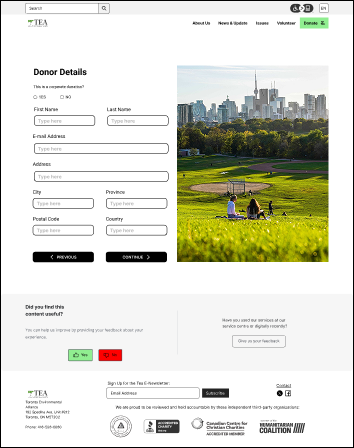
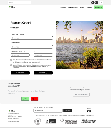
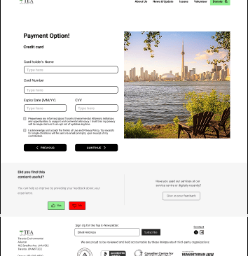
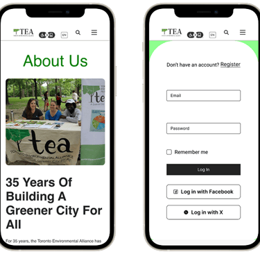
The final high-fidelity mockups brought TEA’s mission to life through bold typography, vibrant visuals, and user-focused functionality. A striking Toronto skyline hero image, interactive neighborhood map, and strong storytelling guides users to take action. The result is the new design is a responsive, visually compelling platform that drives engagement and empowers environmental advocacy.
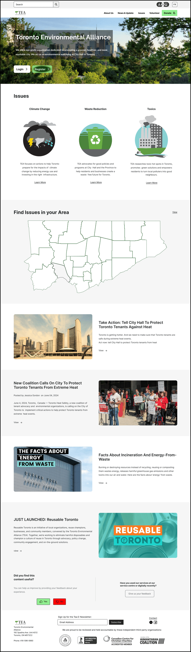
Clear Visual Hierarchy
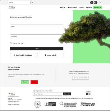
Hero section now features a clear message with clean typography.
Primary CTAs (“Login” and “Register”) are distinct and immediately visible.
Consistent Visual Design
Uniform typography, iconography, and button styles across sections.
Improved White Space & Layout
Spacing between content blocks and sections improving readability.
Enhanced Accessibility Features
Accessibility toggle for physical disabilities
High contrast text and interactive cues (e.g., button styles) aid usability.
Refined Navigation Clarity
Simplified top navigation with clearer section names and visual grouping.
“Issues” and “Volunteer” sections have descriptive icons and are easy to scan.
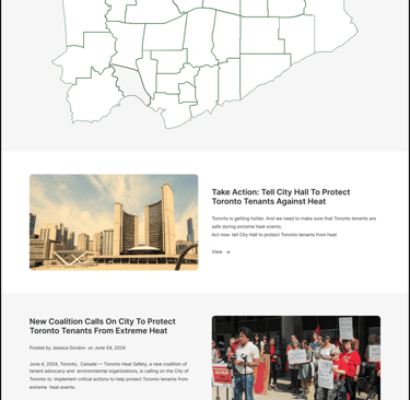
Localized Engagement via Interactive Map
Users can explore environmental issues by region, personalizing their experience.
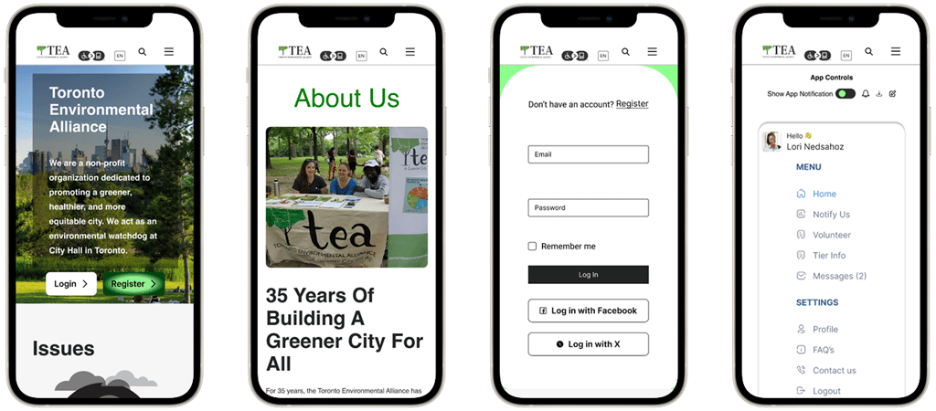
Gamified Volunteer Portal
Introduction of “tree ranks” incentivizes participation in community cleanups and reporting.
Engaging Blog & Storytelling Section
Fresh content includes actionable articles and educational insights.
Emotionally Engaging Content
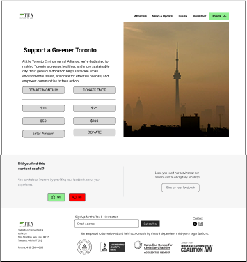
Stronger imagery support emotional appeal for Donations and Volunteering.
Footer Utility Maximized
Streamlined footer content organized for ease of access.
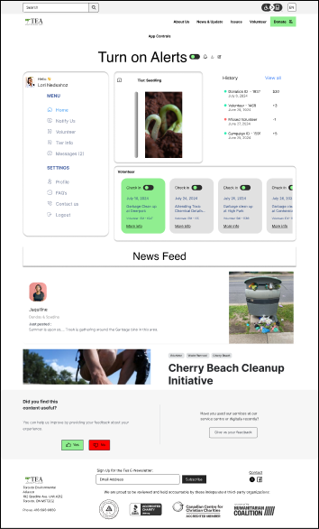
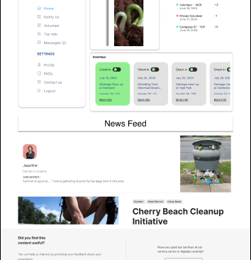

Mobile Design
Watch the Redesign in Action

Check out the video walkthrough of the Toronto Environmental Alliance website redesign, now live on YouTube. This video highlights my contributions to the project, where I led the wireframing, user experience design, interface design, and visual design.
From creating intuitive user flows to building a cohesive and accessible UI, this redesign focused on aligning TEA’s digital presence with its mission to inspire environmental action in Toronto.
To evaluate the usability and overall effectiveness of the redesigned TEA website, a user testing session was conducted with two participants: a local Toronto resident and an instructor. The testing aimed to validate whether the redesign addressed previous usability issues, enhanced accessibility, and reinforced TEA’s mission of fostering a greener, healthier, and more equitable city.
Conclusion
What Was Tested & Results:
Navigation
✔ Both users found the new navigation bar intuitive and straightforwardAccessibility & Language Options
✔ Accessibility button and French language toggle praised as inclusive and valuable additionsInteractive Features
✔ Neighborhood map was engaging and easy to use
⚠ Some confusion about how the gamified “tree rank” system worked within the online portalVisual Design & Layout
✔ Bold, modern look described as trustworthy and more aligned with TEA’s environmental goalsDonation Experience
⚠ Mixed reactions to emotional imagery used on the donation page:One found it emotionally compelling and persuasive
Another found it borderline manipulative
User Testing
Next Steps
🎥 Content Expansion: Incorporate videos, infographics, and success stories to deepen engagement and improve information retention.
📊 Performance Monitoring: Implement ongoing usability testing and user feedback surveys to adapt to changing needs.
🗺️ Enhanced Interactivity: Add real-time updates to the neighborhood map (e.g., upcoming events, cleanups, volunteer needs) to boost local involvement.
To evaluate the usability and overall effectiveness of the redesigned TEA website, a user testing session was conducted with two participants: a local Toronto resident and an instructor. The testing aimed to validate whether the redesign addressed previous usability issues, enhanced accessibility, and reinforced TEA’s mission of fostering a greener, healthier, and more equitable city.
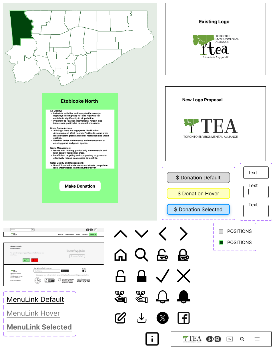
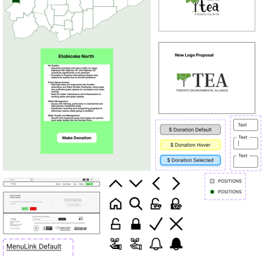


UI Style Guide
The style emphasizes a clean, modern, and approachable aesthetic, aligning with TEA’s values of transparency, engagement, and sustainability. It incorporates bold typography, vibrant colors, and accessible design principles to foster trust and inclusivity.
UI Style Direction
UI Style Adjectives
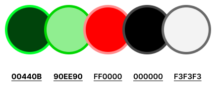
Color Palette
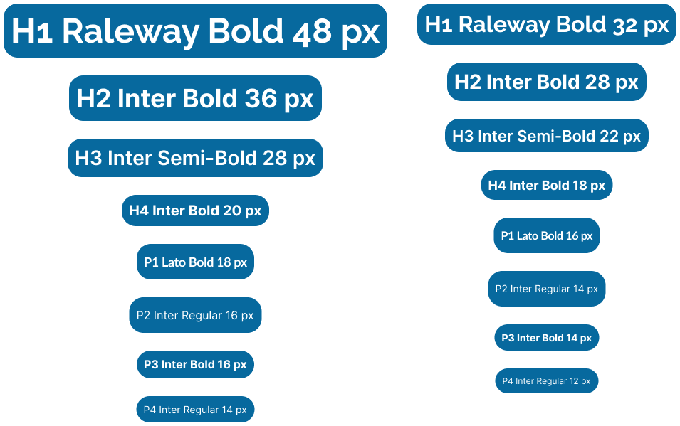
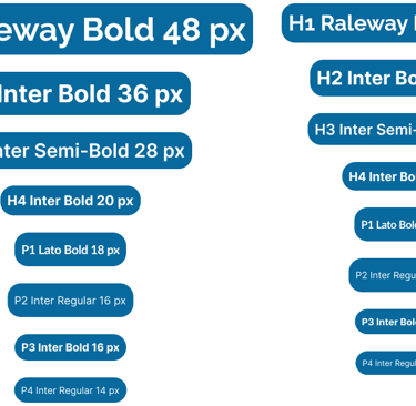
The font choices balance professionalism and approachability, ensuring readability and emotional resonance with users.
Typography
UI Components I Designed